5 Must-Know CSS Features of 2024
The world of CSS is constantly evolving, giving web developers like you even more powerful tools to create beautiful and responsive user interfaces.
This year is no different! Several key features have become more widely supported by browsers, making them prime candidates for your CSS toolbox.
Let's dive into five of these features and explore how they can elevate your web design projects.
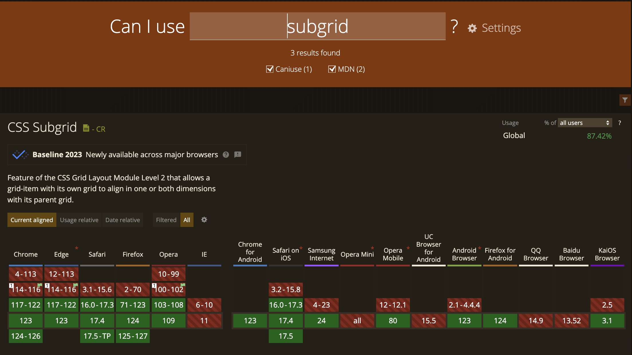
Subgrid
Imagine creating complex grid layouts within a single grid container. That's the power of subgrid!
It allows you to define a sub-grid system within a grid item, providing a hierarchical approach to layout structuring. This is particularly useful for building intricate user interfaces with nested components.
Subgrid utilizes the subgrid property on a grid item to define a new grid within it. You can specify grid properties like grid-template-columns and grid-template-rows for the subgrid, creating a nested grid structure. This enables precise control over the layout of elements within a grid item, promoting a more organized and flexible approach to web design.
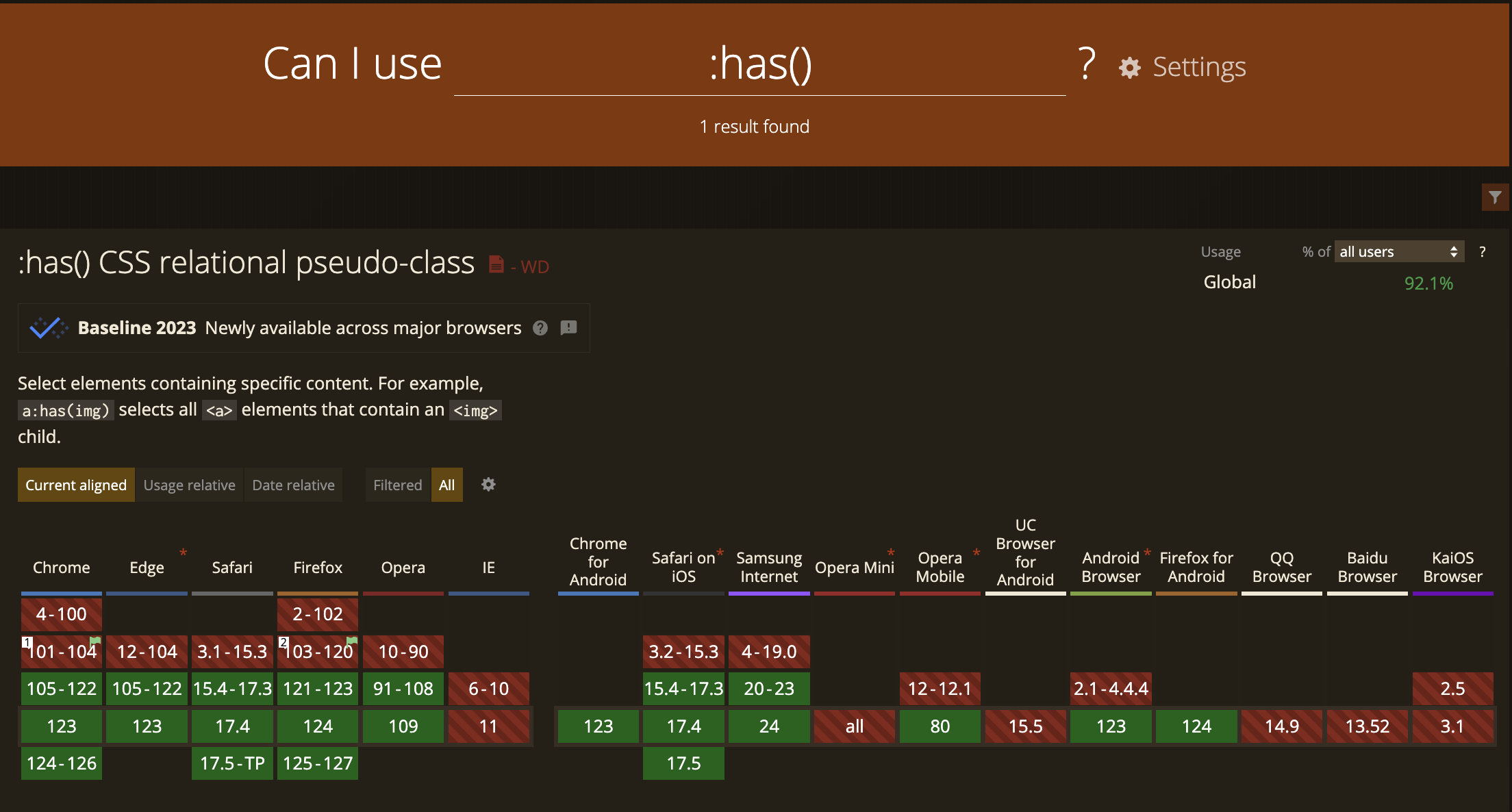
:has() Pseudo-Class
The :has() pseudo-class is a game-changer for targeting elements based on their relationship with descendant elements.
This eliminates the need for complex selector chains and improves code maintainability.
:has() targets an element based on a selector that matches one or more of its descendant elements. This allows you to style parent elements based on the presence or state of their child elements.
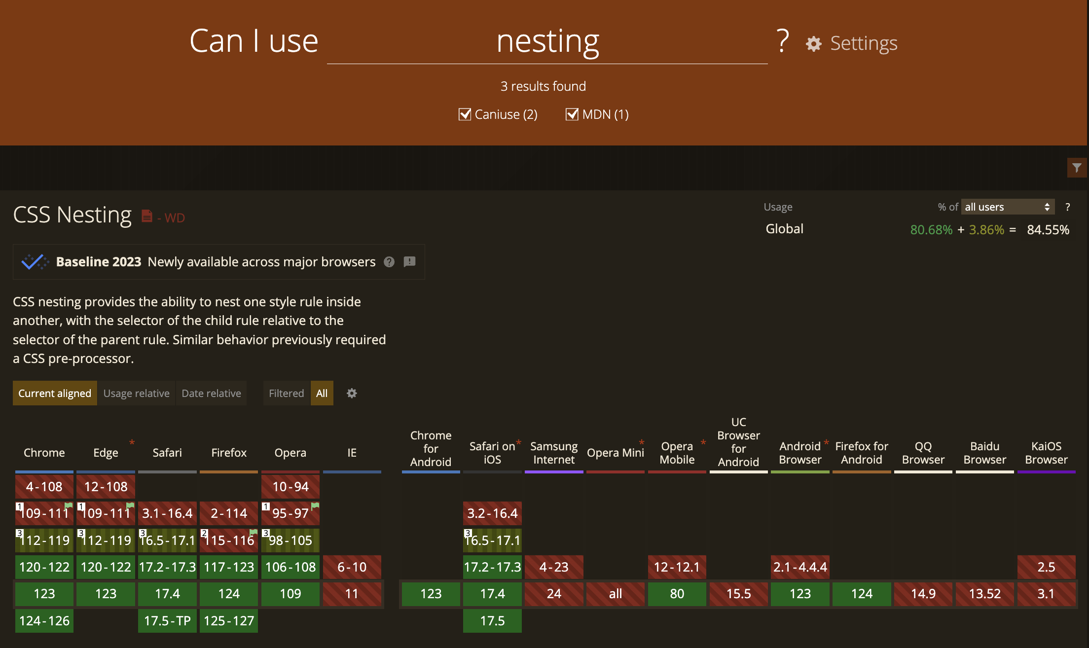
Nesting
CSS nesting is a feature that allows you to define styles for child elements within a parent element using indentation.
This can significantly improve the readability and maintainability of your CSS code, especially when working with complex styles.
Here's a basic example of how nesting works:
/* Without nesting selector */
parent {
  /* parent styles */
  child {
    /* child of parent styles */
  }
}

/* With nesting selector */
parent {
  /* parent styles */
  & child {
    /* child of parent styles */
  }
}

/* the browser will parse both of these as */
parent {
  /* parent styles */
}
parent child {
  /* child of parent styles */
}
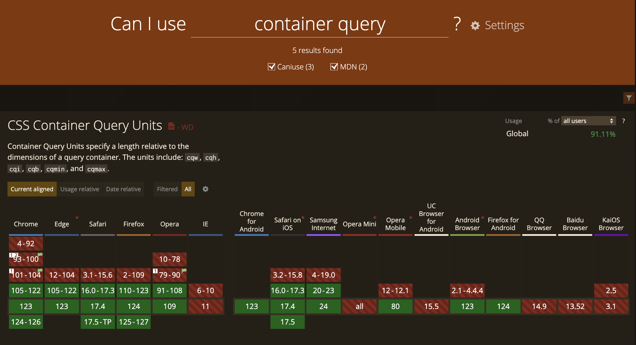
Container Queries
Container queries are a powerful new feature in CSS that allows you to apply styles to the children of an element based on the size of that element, not just the entire viewport.
This offers a more granular approach to responsive design compared to traditional media queries.
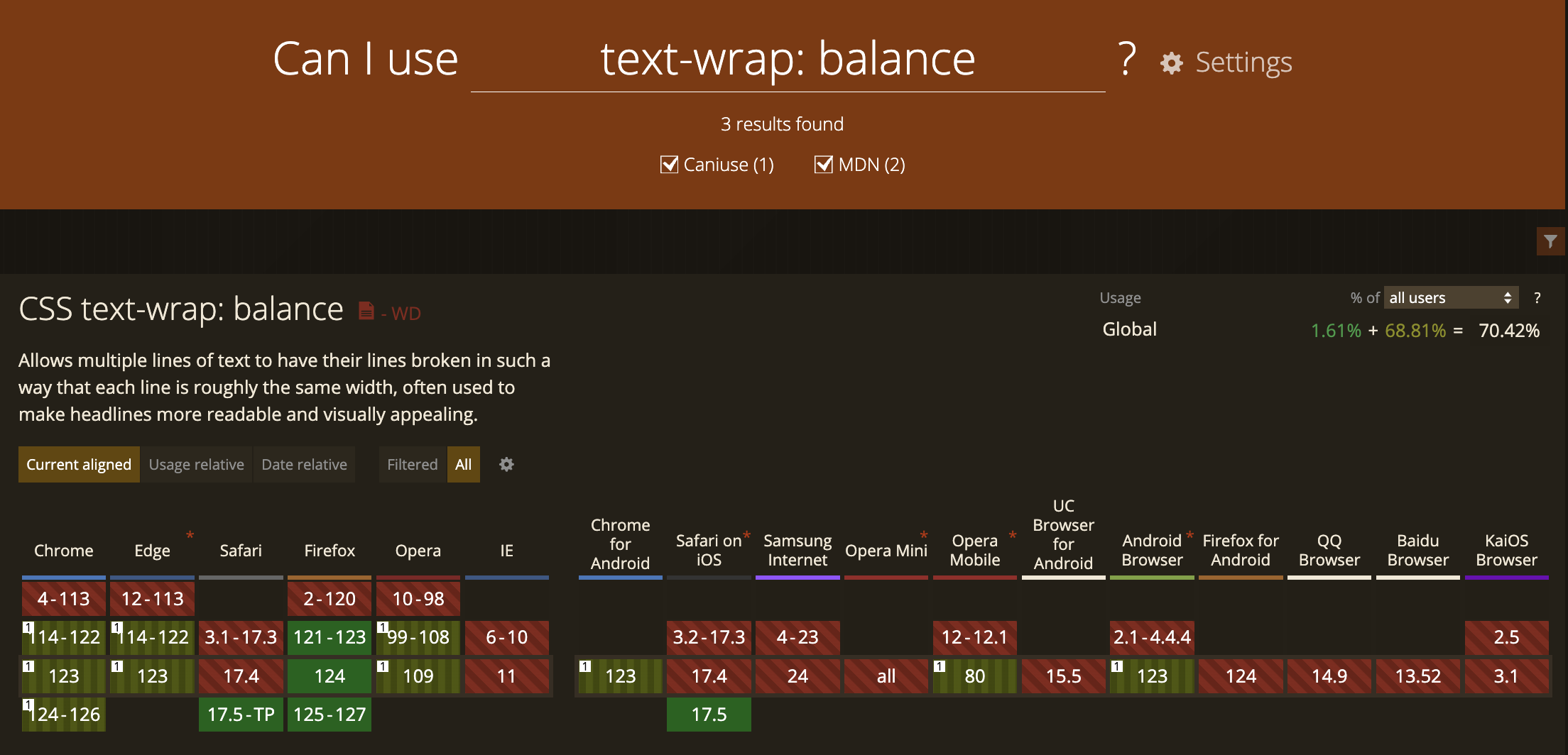
text-wrap: balance
text-wrap: balance is a CSS property that controls how text inside an element wraps onto multiple lines.
It prioritizes creating lines with roughly the same width, aiming for a more aesthetically pleasing and balanced layout, especially for headings and titles.
This can enhance readability and visual appeal on your web pages.
Wrapping Up
I hope that you found this post helpful.
If some info is outdated or incorrect, or you have anything to add, say or ask, please contact me via email.