How Two Front-End Developers Built an E-Commerce App in 10 Weeks
“Thanks to everyone on the Uncutgems team who supported me. Special appreciation to Miryang Jung, a trusted friend and the Lead Frontend Engineer, for always guiding me towards better solutions.”
Download Fabrill on iOS | Download Fabrill on Android
Our Journey
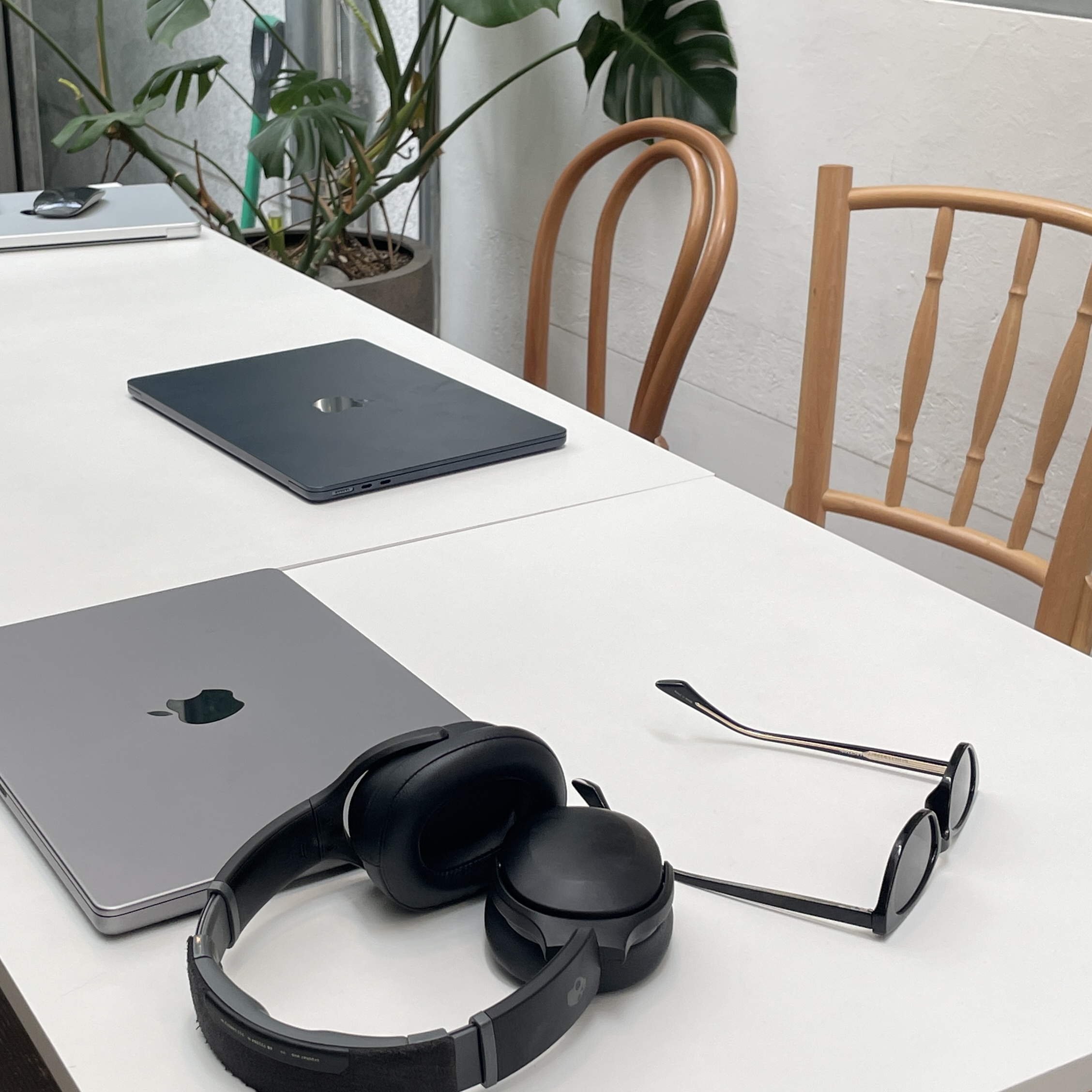
Building a thriving e-commerce app in just 10 weeks might sound ambitious, but we made it happen.
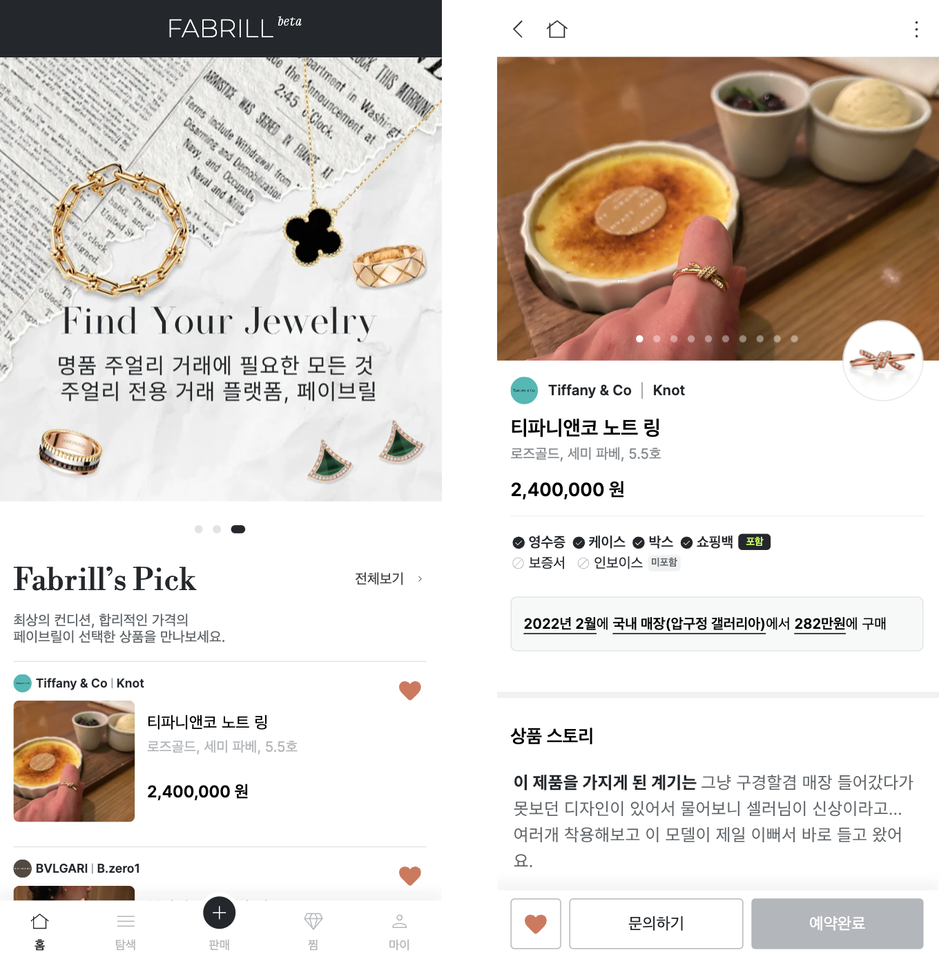
As the first front-end developer at a budding startup, I was tasked with creating a minimum viable product (MVP) for a luxury brands' pre-owned jewelry marketplace. With a tight deadline to launch a functional app with payment processing, dynamic data, and a polished user interface, the pressure was on.
Remarkably, I built the MVP in just one week – a true sprint. But this wasn't a solo act for long. The MVP's success confirmed our concept's potential, and to scale for a full production launch, another front-end developer joined our team.
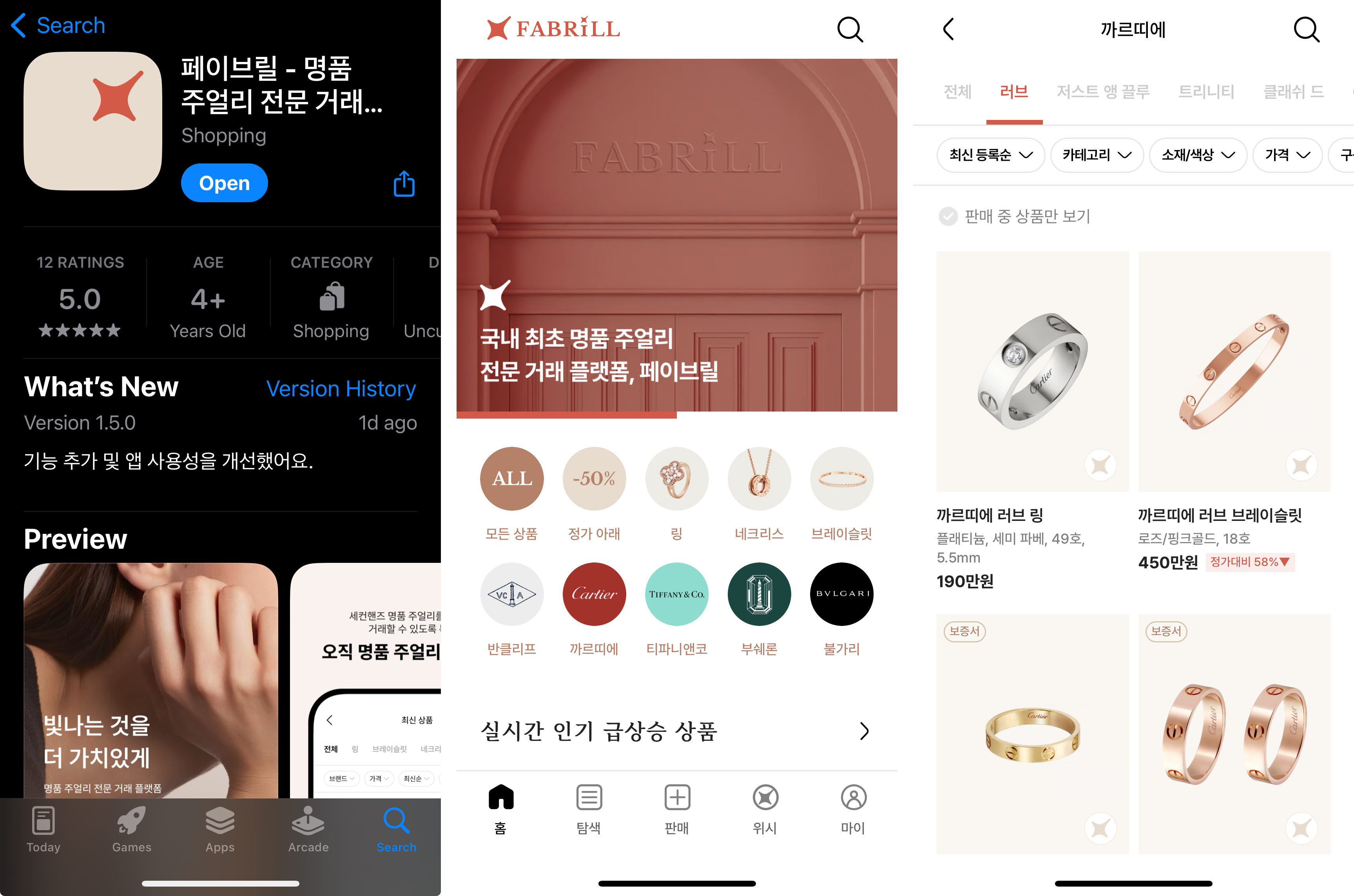
Together, we had 10 weeks to create a scalable mobile app. While the timeline was challenging, we strategically chose the right tech stack – a balance between rapid development and long-term maintainability.
This approach, combined with efficient teamwork and a mindset of continuous learning, enabled us to achieve our ambitious goal within the set timeframe.
Our Tech Stack
Selecting the right tech stack was crucial for achieving our ambitious goal within the tight timeline. We carefully chose tools that balanced rapid development and long-term maintainability. Here's what powered our journey:
Supabase

With our prior experience with Supabase, it was a natural choice as our backend-as-a-service (BaaS) solution. Supabase eliminated the need for a separate database or hiring a dedicated backend developer initially.
As an open-source alternative to Firebase, it provided a comprehensive suite of features, including authentication, authorization, real-time databases, storage, and serverless functions, enabling rapid deployment without managing our own backend infrastructure. Additionally, Supabase's move to General Availability from April 15, 2024, signaled its growing reliability.
Next.js 13 App Router (Currently 14+)

To leverage the latest advancements and minimize legacy code, we opted for the latest Next.js version (13 or higher) for our e-commerce application. This decision brought several key advantages:
-
SEO benefits: Server-side Rendering (SSR) and Static Site Generation (SSG) ensured search engines could easily crawl and index our website content.
-
Improved Performance: Code-splitting and automatic code optimization led to faster loading times for a smoother user experience, crucial for conversion rates.
-
Enhanced Developer Experience: Hot reloading and automatic routing accelerated development cycles.
-
Scalability and Flexibility: Next.js could seamlessly handle our growing e-commerce needs, integrating with various data fetching methods and APIs.
Typescript

In a startup environment with potentially limited code review time, type safety was essential for maintaining code quality and promoting maintainability.
TypeScript not only enhanced code quality but also improved developer productivity and seamlessly integrated with the existing JavaScript ecosystem. As a powerful tool for building robust and scalable web applications, TypeScript was a natural choice for our project.
Vercel

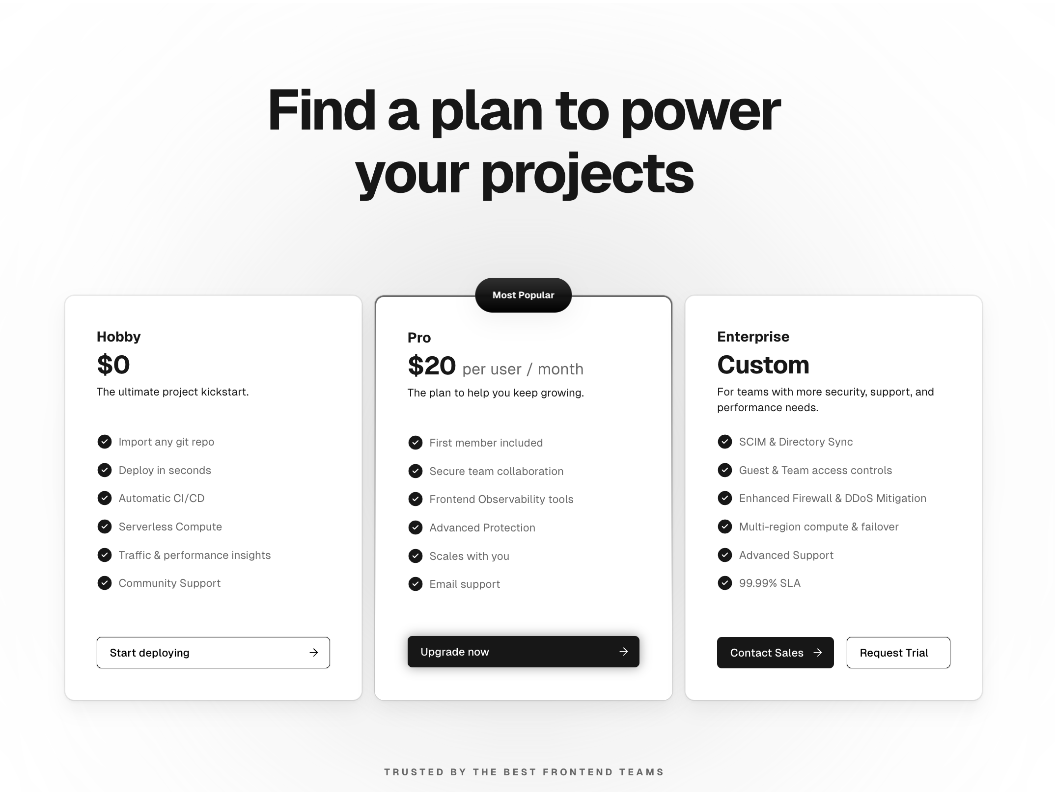
While cost-effectiveness remains a priority, we migrated to Vercel's Pro Plan from Cloudflare Pages.
It is worth paying for Vercel since it is built specifically for Next.js and provides built-in support for Incremental Static Regeneration (ISR), which allows Next.js applications to update content periodically without requiring a full redeployment.
This feature was particularly valuable for our e-commerce application, where product items and pricing could be updated dynamically without the need for a complete rebuild and redeployment.
pnpm

To optimize efficiency and save disk space, we migrated from yarn (and then yarn berry) to pnpm. Pnpm excelled in installation speeds, reduced disk space consumption, and improved reliability through dependency isolation within workspaces.
React Native/WebView/CodePush
With limited mobile development experience, we relied on the lead engineer's recommendation for a combination of React Native, WebView, and CodePush:
-
React Native allowed us to build cross-platform mobile apps using the familiar JavaScript and React stack, speeding up development compared to native languages while providing a near-native user experience.
-
WebView enabled us to embed web content within the mobile app, useful for integrating existing web functionalities or features.
-
CodePush from Microsoft enabled over-the-air updates for our React Native app, critical for real-time bug fixes and minor feature enhancements without app store delays.
This combination suited our situation, which required frequent updates and support for both iOS and Android platforms.
App Center

Thorough quality assurance (QA) was essential for our mobile app, and App Center emerged as the perfect solution, offering:
-
Streamlined Build and Distribution: Automated builds based on code branches saved time for QA testing and allowed us to focus on functionality testing.
-
Comprehensive Testing Tools: A suite of tools included manual testing on real devices, automated UI testing, and crash reporting for identifying bugs and ensuring app stability.
-
Efficient Feedback Loop: Integration with bug tracking systems facilitated smooth communication between developers and QA testers, accelerating the development cycle.
-
Unified Platform: A centralized platform for managing all aspects of the app lifecycle, from build and testing to distribution and analytics, simplified the QA process.
Tailwind CSS and shadcn/ui
To prioritize speed and efficiency, we adopted Tailwind CSS, a utility-first framework that empowered rapid UI prototyping. Its extensive library of pre-built classes allowed us to quickly experiment and construct components without getting bogged down in extensive CSS writing. Tailwind CSS also offered the flexibility to achieve a unique design aesthetic while maintaining the ability to customize the look and feel as needed.
However, building everything from scratch wouldn't have been an efficient use of our limited time. That's where shadcn/ui came into play. This fantastic collection of reusable components, built on top of Radix UI and Tailwind CSS, provided a treasure trove of pre-built, accessible components that saved us precious development hours. We could focus on crafting custom components while leveraging shadcn/ui's foundation to ensure a cohesive UI.
Storybook

Once we had our custom components in place, we turned to Storybook as our go-to tool for UI component management. Storybook allowed us to isolate and visualize individual components in various states, making development, debugging, and documentation a breeze. It also facilitated interactive prototyping, enabling clear communication and seamless feedback with a designer. Additionally, Storybook served as a centralized repository for all our reusable components, making them easily discoverable and accessible across projects.
Sentry

To ensure a smooth user experience, we implemented Sentry, an application monitoring platform. Sentry acted as a central hub for error reporting, capturing detailed information about any issues users might encounter, including stack traces, environment variables, and user information. With this data at our fingertips, pinpointing the root cause of problems and implementing solutions became significantly faster.
Sentry went beyond reactive solutions; it could even identify potential issues before they impacted users – a true lifesaver in the fast-paced world of startup development. By integrating Sentry with our Slack, we received real-time alerts about any errors, allowing for immediate action and a consistently high-quality user experience.
Insights Gained
Looking back on this whirlwind project, we gained invaluable insights that extend far beyond the app itself.
Firstly, the importance of clear and consistent communication within the team cannot be overstated. Openly expressing concerns and discussing ideas proved crucial for navigating challenges and making informed decisions.
Secondly, we learned the value of thorough documentation. While video tutorials and articles might seem like a quicker fix initially, diving deep into official documentation saved us time and effort in the long run, providing a more comprehensive understanding of the tools and technologies we were working with.
Another key takeaway was the power of prioritization and iterative development. Rather than attempting to build a complete and feature-rich application from the outset, we found that the best approach was to start with a minimal viable product (MVP) – a smaller, more focused version of the core functionality. This allowed us to gather user feedback quickly and iterate based on valuable insights, ensuring that we were building a product that truly met the needs of our target audience.
Moreover, this project reinforced the importance of choosing the right tools and technologies for the job. Our strategic selection of a tech stack that balanced rapid development and long-term maintainability was crucial in achieving our ambitious goal within the tight timeline.
Finally, we experienced firsthand the power of focused execution and teamwork in the fast-paced startup world. Despite the challenges and time constraints, our ability to work efficiently as a team, continuously learn, and remain adaptable enabled us to deliver a successful e-commerce app in just 10 weeks.
Building an e-commerce app in such a short timeframe with just two developers was undoubtedly a daunting task, but by embracing these key lessons and insights, we were able to turn what seemed like an impossible feat into a testament to the power of strategic planning, execution, and collaboration.
Remarkable Results
Our hard work and strategic approach paid off, as the e-commerce app we built is now driving over $70,000 in monthly transactions. This is a remarkable achievement for a startup operating in the niche vertical of a luxury brands' pre-owned jewelry marketplace. The app's success not only validates our concept but also demonstrates the power of focused execution and the right tech stack.
Wrapping Up
I hope that you found this post helpful.
If some info is outdated or incorrect, or you have anything to add, say or ask, please contact me via email.