Make Scrolling Smooth with CSS Scroll-Snap

Stop using bulky carousel libraries just for a smooth scrolling!
CSS offers a powerful and lightweight solution for creating smooth, interactive scrolling experiences: scroll-snap.
With scroll-snap, you can control how elements on your webpage scroll into view, making your site more engaging for visitors.
This post will dive into scroll-snap, explaining its features and showing you how to use it in CSS and TailwindCSS with examples.
Browser Compatibility
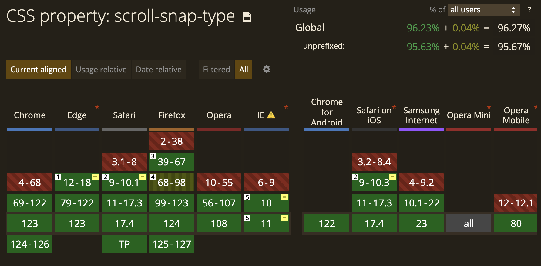
The good news is that scroll-snap is supported by most modern browsers, including Chrome, Firefox, Safari, Edge, and Opera. You can check caniuse.com for a detailed breakdown of browser compatibility.
This means you can be confident that your scroll-snap effects will work for the vast majority of people visiting your website.
Understanding Scroll-Snap
Scroll-snap empowers you todefine how elements scroll into view on your web page. Here's a breakdown of the key properties that unlock this magic:
-
scroll-snap-type: This property dictates how strictly snapping occurs and on which axis. It offers various values for customization:-
Snap strictness:
none: Scroll snapping is disabled.proximity: Snapping occurs only at defined snap points (if any).mandatory: Snapping always occurs at defined snap points.
-
Scroll snap axis:
x: Snapping occurs horizontally.y: Snapping occurs vertically.block: Snapping occurs on the block axis (depends on writing mode).inline: Snapping occurs on the inline axis (depends on writing mode).both: Enables snapping on both X and Y axes, allowing for diagonal snapping with additional configuration.
-
-
scroll-padding: This property adds padding to the scroll container (the element with scroll-snap enabled) before and after the snap points. It refines the alignment of snapped elements within the container. It accepts standard padding values (e.g., 10px, 2rem) for all sides or individual properties for specific padding directions (e.g.,scroll-padding-top: 5px). -
scroll-snap-margin: This property adds margins to the snap points themselves, creating extra space between snapped elements. It accepts standard margin values similar to scroll-padding. -
scroll-snap-align: This property controls how the snap point aligns within the element being snapped. It accepts these values:none: Alignment is not specified.start: Aligns the snap point to the element's start edge.end: Aligns the snap point to the element's end edge.center: Centers the snap point within the element.
-
scroll-snap-stop: This property determines whether scrolling stops at the end of the scroll container or continues past it. It accepts two values:normal: Scrolling stops at the end of the scroll container.always: Scrolling continues past the end of the scroll container. This can be useful for specific effects, like allowing users to scroll slightly beyond the last snap point.
By understanding these properties, you can create a variety of scroll-snap effects to enhance your website's user experience.
Bringing Scroll-Snap to Life
Example in CSS
Example in TailwindCSS
export default function Example() {
  return (
    <div className="flex">
      <Head>
        <title>Next.js Tailwind Scroll Snap Type: Y</title>
      </Head>
      <div className="w-1/2 overflow-y-scroll border-r border-gray-300 snap-mandatory">
        <h2 className="fixed w-1/2 text-center text-white font-mono text-lg top-0">
          scroll-snap-type: y <em>mandatory</em>
        </h2>
        <ul>
          {Array.from({ length: 20 }, (_, index) => (
            <li
              key={index}
              className="py-20 border-b border-white bg-black text-white text-center"
            >
              Lorem ipsum dolor sit amet.
            </li>
          ))}
        </ul>
      </div>
      <div className="w-1/2 overflow-y-scroll snap-proximity">
        <h2 className="fixed w-1/2 text-center text-white font-mono text-lg top-0">
          scroll-snap-type: y <em>proximity</em>
        </h2>
        <ul>
          {Array.from({ length: 20 }, (_, index) => (
            <li
              key={index}
              className="py-20 border-b border-white bg-black text-white text-center"
            >
              Lorem ipsum dolor sit amet.
            </li>
          ))}
        </ul>
      </div>
    </div>
  );
}
Scroll-Snap Hiccups to Avoid
Scroll-snap is great, but there are a few things to keep in mind:
Browser Quirks
Test your scroll-snap implementation across different browsers (Chrome, Firefox, Safari, Edge) to ensure consistent snapping behavior. Minor differences in how browsers interpret the code can cause issues.
Misplaced Magic
Double-check the alignment of your snap points and the size of your scrolling container to avoid unexpected scrolling behavior. If these are not set up correctly, elements might not snap into view as expected.
Performance Drain
Keep animations within snapping elements lightweight and avoid using too many snap points. Too much complexity or too many snap points can cause sluggish scrolling or slow page loads.
Wrapping Up
I hope that you found this post helpful.
If some info is outdated or incorrect, or you have anything to add, say or ask, please contact me via email.